Documentation
Welcome to the genicons.io documentation. Learn how to integrate your custom icons into your projects in minutes, whether using CSS, React, Vue.js, or Web Components.
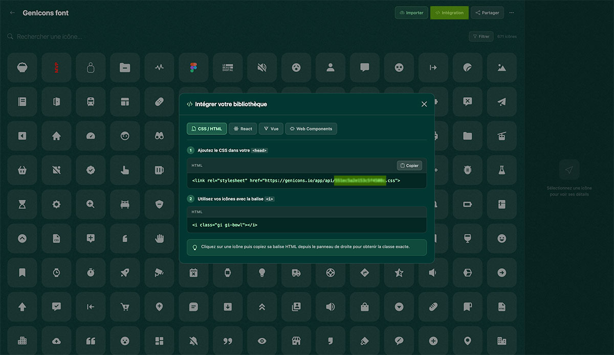
CSS via CDN
The simplest way to use your genicons. Just add this line to the <head> of your HTML page.
<!-- Genicons CSS CDN -->
<link rel="stylesheet" href="https://genicons.io/app/api/{votre_public_code}.css">Log in to your genicons.io dashboard, open your collection and go to settings. Your public_code is a unique hexadecimal identifier.
Starter Template
Here's a complete HTML template to get started quickly with genicons.
<!DOCTYPE html>
<html lang="fr">
<head>
    <meta charset="UTF-8">
    <meta name="viewport" content="width=device-width, initial-scale=1.0">
    <title>Mon projet</title>

    <!-- Genicons CSS -->
    <link rel="stylesheet" href="https://genicons.io/app/api/{votre_public_code}.css">
</head>
<body>

    <!-- Filled icon (color controllable via CSS) -->
    <i class="gi gi-icon-name"></i>

    <!-- Multicolor icon (original colors) -->
    <i class="gi gi-icon-name-origin"></i>

    <!-- Outline icon -->
    <i class="gi gi-icon-name-outline"></i>

</body>
</html>Replace icon-name with the name of your icon as it appears in your genicons collection. Names use kebab-case (e.g., arrow-right, user-circle).
Usage
Use the base class .gi combined with your icon class to display it.
<!-- Filled icons — color controllable via CSS color -->
<i class="gi gi-home"></i>
<i class="gi gi-user"></i>
<i class="gi gi-settings"></i>

<!-- Multicolor icon — preserves original colors -->
<i class="gi gi-logo-origin"></i>

<!-- Outline icon -->
<i class="gi gi-home-outline"></i>
CSS Classes Reference
| Class | Description |
|---|---|
.gi |
Required base class (display: inline-block, width/height: 1em) |
.gi-{name} |
Monochrome version — color follows the CSS color property |
.gi-{name}-origin |
Multicolor version — displays original SVG colors |
.gi-{name}-outline |
Outline version — strokes only |
React
Install the React package to use your icons as native components. Compatible with React 16.8+ (Hooks).
Installation
npm install https://genicons.io/app/api/pkg/react/{votre_public_code}Usage
import { Home, HomeOutline, HomeOrigin } from '@genicons/react';

function App() {
  return (
    <div>
      {/* Filled icon */}
      <Home size="24px" color="#333" />

      {/* Outline icon */}
      <HomeOutline size="24px" color="blue" />

      {/* Multicolor icon (original colors) */}
      <HomeOrigin size="24px" />
    </div>
  );
}
Props
| Prop | Type | Default | Description |
|---|---|---|---|
size |
string | '1em' |
Icon size (CSS value) |
color |
string | 'currentColor' |
Icon color (CSS value) |
Vue.js
Install the Vue package to integrate your icons into Vue 3 components.
Installation
npm install https://genicons.io/app/api/pkg/vue/{votre_public_code}Usage
<script setup>
import { Home, HomeOutline, HomeOrigin } from '@genicons/vue';
</script>

<template>
  <!-- Filled icon -->
  <Home size="24px" color="#333" />

  <!-- Outline icon -->
  <HomeOutline size="24px" color="blue" />

  <!-- Multicolor icon (original colors) -->
  <HomeOrigin size="24px" />
</template>
Props
| Prop | Type | Default | Description |
|---|---|---|---|
size |
String | '1em' |
Icon size (CSS value) |
color |
String | 'currentColor' |
Icon color (CSS value) |
Web Components
Web Components work with any framework or Vanilla JS. No dependencies required.
Installation
npm install https://genicons.io/app/api/pkg/wc/{votre_public_code}Usage
<!-- Import Web Components -->
<script type="module">
  import '@genicons/wc';
</script>

<!-- Filled icon -->
<gi-home size="24px" color="#333"></gi-home>

<!-- Outline icon -->
<gi-home-outline size="24px" color="blue"></gi-home-outline>

<!-- Multicolor icon -->
<gi-home-origin size="24px"></gi-home-origin>
Attributes
| Attribut | Type | Default | Description |
|---|---|---|---|
size |
string | '1em' |
Icon size (CSS value) |
color |
string | 'currentColor' |
Icon color (CSS value) |
Web Components are compatible with all modern browsers and work with React, Vue, Angular, Svelte, or plain HTML.
Filled
Filled icons use currentColor, meaning they inherit the parent text color. You can change their color via CSS or the color prop.
<!-- CSS -->
<i class="gi gi-home"></i>

<!-- React -->
<Home size="24px" color="tomato" />

<!-- Vue -->
<Home size="24px" color="tomato" />

<!-- Web Component -->
<gi-home size="24px" color="tomato"></gi-home>
Original Colors (Origin)
The Origin version preserves the original SVG file colors. Perfect for logos and multicolor icons.
<!-- CSS -->
<i class="gi gi-logo-origin"></i>

<!-- React -->
<LogoOrigin size="32px" />

<!-- Vue -->
<LogoOrigin size="32px" />

<!-- Web Component -->
<gi-logo-origin size="32px"></gi-logo-origin>Origin icons ignore the color prop because they use the colors embedded in the SVG.
Outline
The Outline version displays only the icon's strokes. Color is controllable just like the Filled version.
<!-- CSS -->
<i class="gi gi-home-outline"></i>

<!-- React -->
<HomeOutline size="24px" color="navy" />

<!-- Vue -->
<HomeOutline size="24px" color="navy" />

<!-- Web Component -->
<gi-home-outline size="24px" color="navy"></gi-home-outline>
Icon Sizing
Genicons icons adapt to text size by default (1em). Here's how to adjust their size.
CSS
.gi {
  width: 1em;
  height: 1em;
}

/* Override the size */
.gi-large {
  width: 2em;
  height: 2em;
}

/* Or via font-size */
.gi {
  font-size: 24px;
}
React / Vue / Web Components
<!-- Via the size prop (React, Vue, Web Components) -->
<Home size="16px" />   <!-- Small -->
<Home size="24px" />   <!-- Medium -->
<Home size="32px" />   <!-- Large -->
<Home size="48px" />   <!-- Extra Large -->
Colors
Filled and Outline icons use currentColor. Change their color via CSS or component props.
CSS
/* Via a CSS class */
.gi-home {
  color: tomato;
}

/* Or inline */
<i class="gi gi-home" style="color: #3b82f6"></i>
React / Vue
<Home color="tomato" />
<Home color="#3b82f6" />
<Home color="rgb(59, 130, 246)" />By default, the icon inherits the text color of its parent. Place an icon inside a button or a link, and it will automatically match the right color.
Figma Plugin
Our Figma plugin lets you import icons directly from your designs to genicons.io, without leaving Figma.
- Install the genicons.io plugin from the Figma community.
- Sign in with your genicons.io account.
- Select the elements to export in Figma.
- Send them directly to the collection of your choice.
API & Endpoints
genicons.io exposes public endpoints to retrieve your icons in various formats.
Available Endpoints
| Method | URL | Description |
|---|---|---|
| GET | /app/api/{public_code}.css |
CSS file for your collection (CDN) |
| GET | /pkg/react/{public_code} |
React npm package (.tgz) |
| GET | /pkg/vue/{public_code} |
Vue npm package (.tgz) |
| GET | /pkg/wc/{public_code} |
Web Components npm package (.tgz) |